BitNinja
SiteProtection
SiteProtection

Building a product from zero

UX/UI design

Research

Building a product from zero

UX/UI design

Research

About the company

SiteProtection was a completely new product under the BitNinja company umbrella. The company's main focus was server security before but they wanted a new product for the end users (aka website owners) as well. Hence BitNinja SiteProtection was born, a hands-free security solution for website owners against targeted cyberattacks.
Project overview and challanges
We had to understand the product and what the company expected from it. Also we had to assess user needs.We had to make new components similar to the company's previous product but different enough to be distinguishable.The time was very short for the whole process because a possible buyer wanted to test the complete software.

User Research

Cybersecurity knowledge
People are curious about cyber security but even if they work in the tech industry they are not aware of many concepts regarding the topic.
Ease of mind
Website owners don't want to worry about hackers and revenue loss. They want to know that their business is safe.
All in one solution
The expected function of a cybersecurity tool is that the user don't have to do anything to guarantee their website's safety yet the product needs to be prepared for all types of attacks.
Futureproof and up to date
A software that is for website protection has to be up to date at all times because new types of cyberattacks and malware appear every day.

The Problem

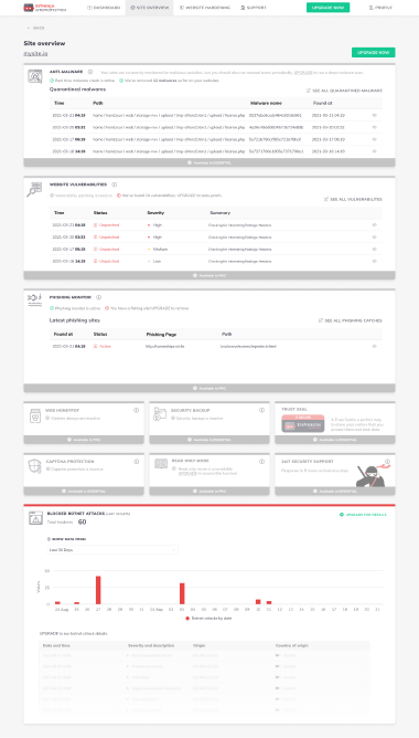
We had to provide enough information for a user that wants to know as much about the state of their website as possible. However we wouldn't want to confuse a small webshop owner who knows very little about cybersecurity. Also we had to communicate with both words and visual queues that their website is safe and unharmed because of the product. The other big challange was that there were some features that were partially available or not available at all in the free and essential subscriptions. We had to show these in a way the user would understand that it is only accessible in a higher subscription level.

Ideation

We started to collect the main features that we wanted to display and provide.
Also we determined which pages were needed. After the first draft we iterated the menu elements many times until it reached it's final form.

Wireframing

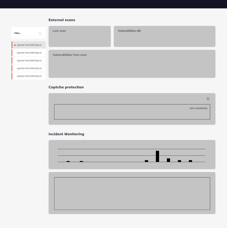
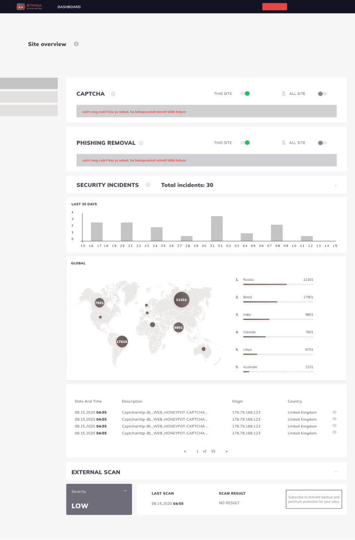
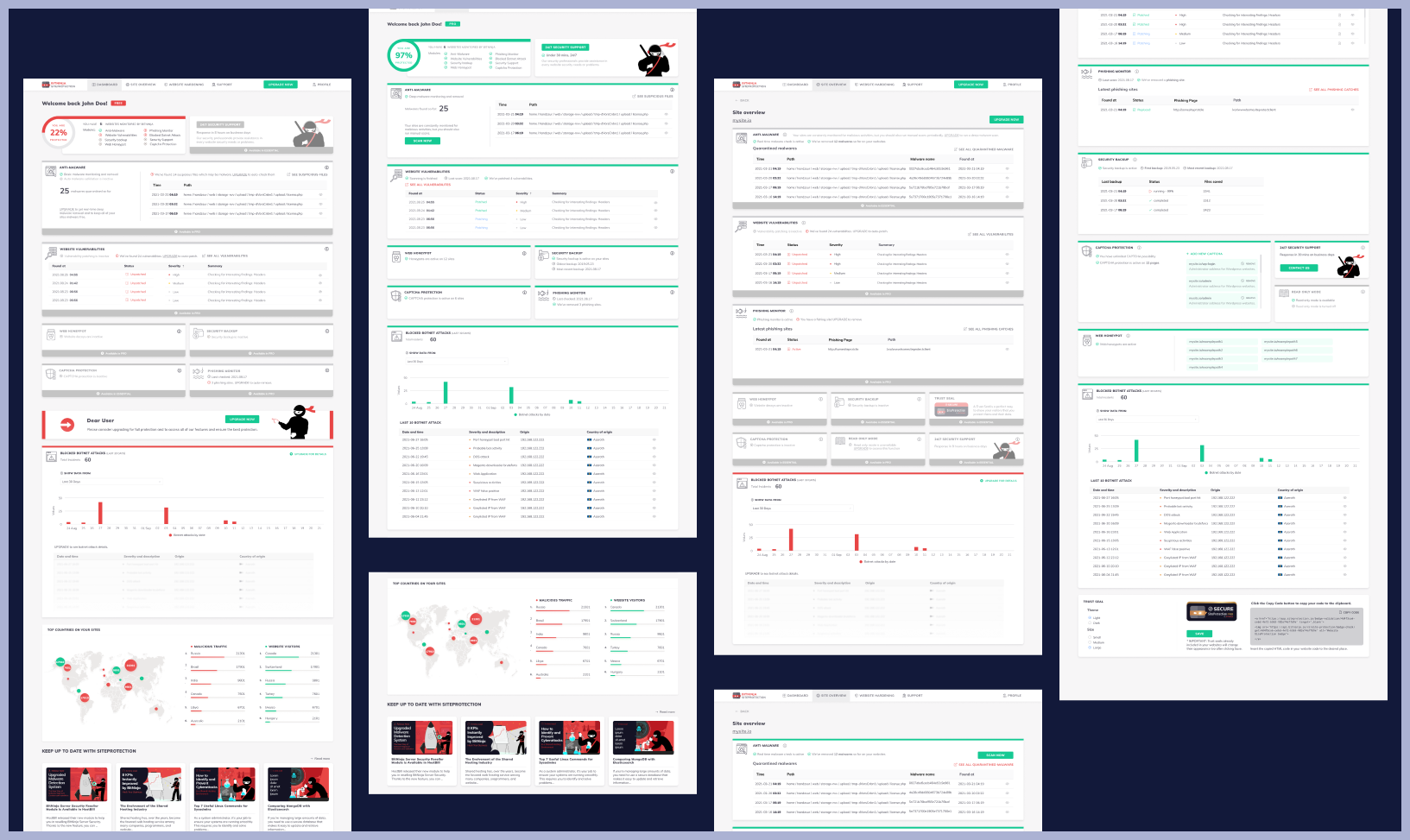
After negotiating the user flow and the required subpages, we started sketching our ideas in Figma. The evolution of the product began and we improved something on it with every iteration considering user and inhouse feedback.
First drafts

User Testing

After multiple rounds of user testing we synthesized our main findings based on the user flow.
Main findings
Some CTAs were unclear
The users didn't understand the diagrams
There were a few numbers that the users didn't understand the meaning of
The meaning of the colors on the cards were unclear
They didn't read too much text
They didn't understand what functions were included in the product
There were buttons they didn't find
The contrast was too low in some cases
The font needed to be bigger and easier to read
The dashboard was mostly clear and understandable
They got confused what features are available for them in free/essential/pro subscriptions

Finalization

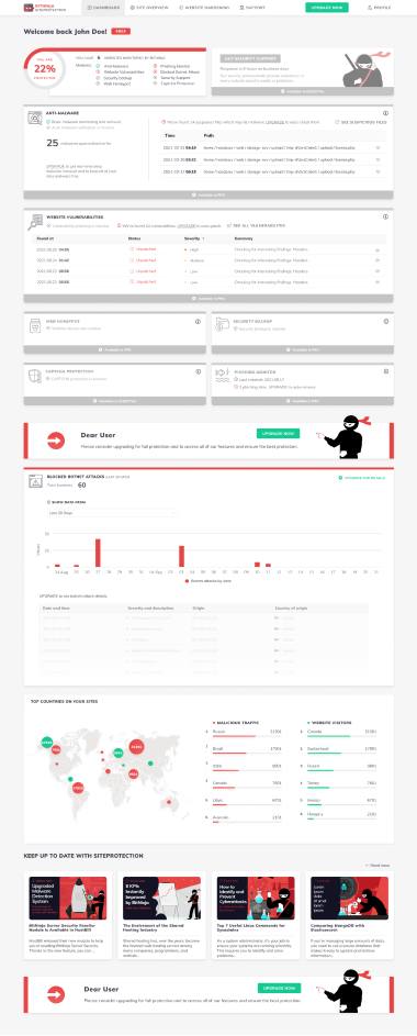
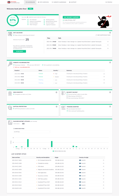
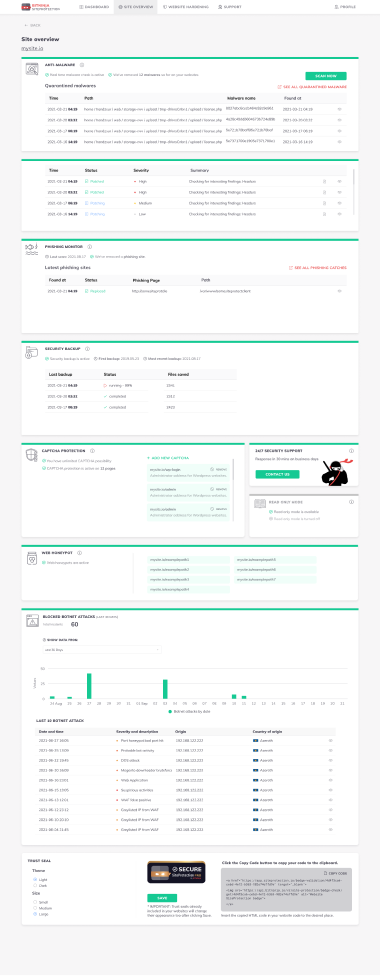
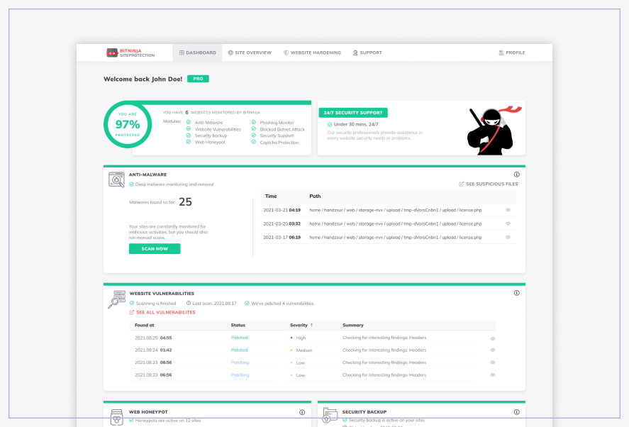
Firstly after extensive user testing we decided that the color for the free subscription tier should be red and alerting and the unavailable features should be grey but the user should still should show them. The pro subscription's color became green to show that the product already did everything for the protection of the user and they have nothing to do to secure their website. We also placed an upgrade CTA on every unavailable feature so the user could easily subscribe for a better package.
We minimalized the text on the screen and only provided the necessary amount of information. We used more visual tools like diagrams, maps, percentages and icons to make the pages easier to understand and navigate.
We placed info buttons on every card so the less proficient in cybersecurity could find out more about the meaning of the modules and what they do.

Learning

There is a balance between too much and too little information. It is hard to find the perfect amount of text that the user can easily understand and read. Visual input is crucial in designing a data heavy product. The availability of features has to be clear and color coded.
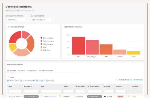
BitNinja Incidents Screen BitNinja is a multi-layered security software with an interface that has a lot of difficult to understand tech jargon and information heavy tables. My task was to make on of the most viewed pages of the product easy to use, navigate and understand.

Learn More